I know you may be thinking that choosing paint colors to set the mood with your furniture is a daunting task. But fear not, because I am here to guide you through the fascinating world of color psychology. By understanding how different colors affect our emotions, we can create a safe and comfortable environment in our homes. In this article, we will explore the impact of warm colors, the soothing effect of cool colors, and the energizing power of bright colors. We will also discuss the versatility of neutrals and how to harmonize your furniture with complementary colors. So let’s dive in and unlock the secrets of color psychology to transform your space into a haven of tranquility and style.
Key Takeaways
- Colors evoke specific emotions and influence mood
- Warm colors like red and orange create energy and excitement
- Cool colors like blue and green promote relaxation and calmness
- Different colors can elicit various emotional responses
Understanding Color Psychology
Understanding color psychology helps me choose the right paint colors to create the desired mood with my furniture. The psychology of color combinations plays a crucial role in determining the emotional impact of a room. Colors have the power to evoke specific emotions and influence our mood. For example, warm colors like red and orange are known to create a sense of energy and excitement, while cool colors like blue and green can promote relaxation and calmness. By understanding how colors affect our emotions, I can create a safe and comfortable environment in my home. I can choose colors that promote a sense of security, serenity, and positivity. This knowledge empowers me to make informed decisions when selecting paint colors for my furniture, ensuring a harmonious and emotionally satisfying living space.
The Impact of Warm Colors
To create a vibrant and energetic atmosphere in my home, I can utilize warm colors in my furniture and paint choices. Warm colors like red and yellow have a significant impact on our mood and emotions. The psychology of red suggests that it is associated with energy, passion, and excitement. Incorporating red elements in my furniture or using red accents in my paint choices can instantly uplift the mood of the space and create a lively environment. On the other hand, the impact of yellow is often associated with happiness, optimism, and warmth. Adding yellow hues to my furniture or using yellow as a dominant color in the paint can create a welcoming and cheerful ambiance. By understanding the psychology of these warm colors, I can create a safe and inviting space in my home.
The Effect of Cool Colors
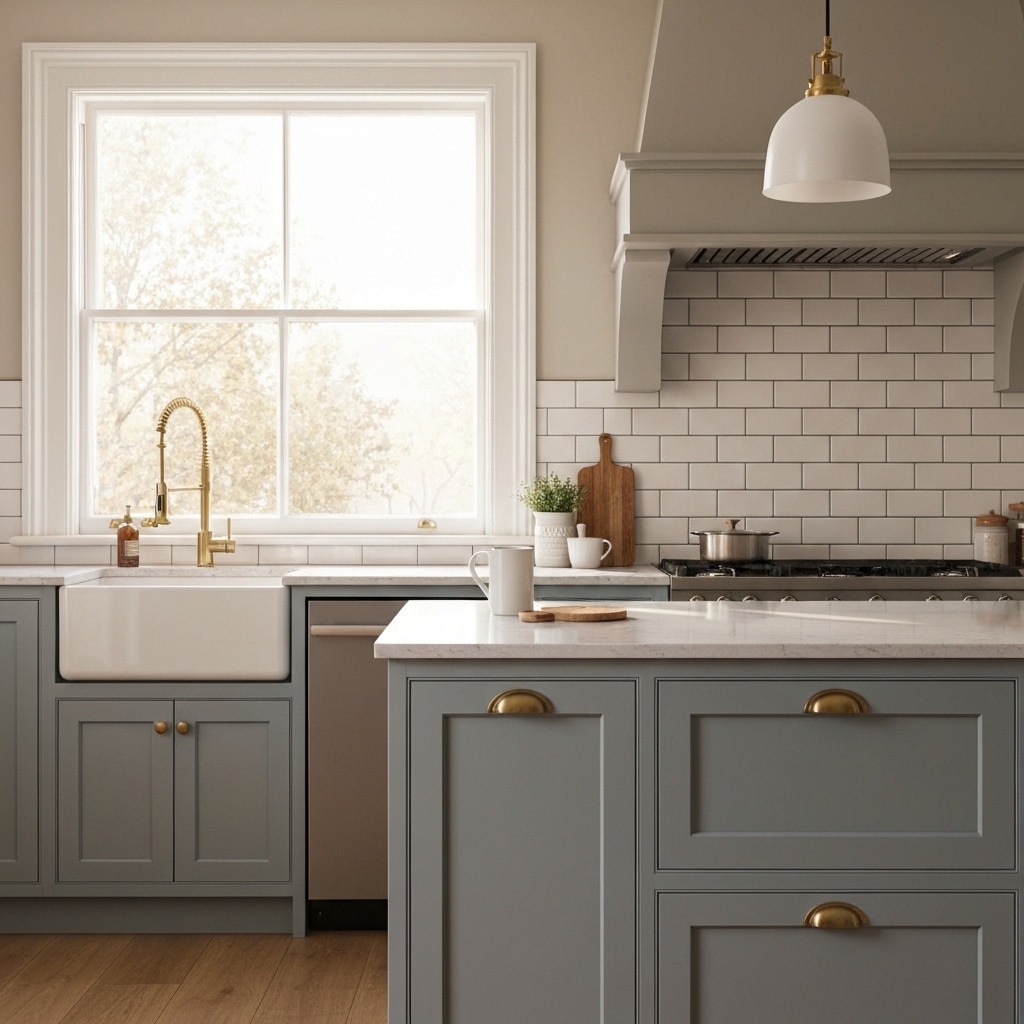
Cool colors have a calming and soothing effect on our mood and emotions. When it comes to cool color psychology, these colors are often associated with feelings of relaxation, tranquility, and serenity. Cool color schemes, such as blues, greens, and purples, can create a sense of peace and harmony in a space. These colors are often used in bedrooms and living rooms to promote a sense of calmness and help us unwind after a long day. Cool colors also have the ability to make a room feel more spacious and open, which can contribute to a sense of safety and security. So, if you’re looking to create a safe and peaceful environment, consider incorporating cool colors into your home decor.
Creating a Calming Atmosphere
In my experience, incorporating calming colors into your home decor can create a soothing and peaceful atmosphere. When it comes to creating a cozy ambiance, choosing soothing hues is essential. Soft and muted colors like light blues, pale greens, and gentle grays can evoke feelings of tranquility and relaxation. These colors can help to reduce stress and promote a sense of calmness in your living space. By surrounding yourself with these soothing hues, you can create a safe and nurturing environment that allows you to unwind and recharge. Whether it’s in your bedroom, living room, or even your home office, incorporating calming colors can help you create a peaceful sanctuary where you can escape from the chaos of everyday life.
Energizing Your Space With Bright Colors
As I continue exploring the impact of color psychology on creating a desired mood with furniture, incorporating bright colors can effectively energize your space. Bright color combinations and bold color choices can create a lively and vibrant atmosphere that promotes energy and productivity. When selecting bright colors for your space, consider using shades of yellow, orange, or red, as these colors are known to stimulate the senses and increase energy levels. It is important to strike a balance between using bright colors and maintaining a safe environment. Incorporating these colors in moderation, such as through accent pieces or furniture, can add a pop of energy without overwhelming the space. Remember to consider the size and lighting of your room when making bold color choices to ensure a harmonious and energizing space.
Using Neutrals for Versatility
To further explore the impact of color psychology on creating a desired mood with furniture, let’s now delve into the versatility of using neutrals. By incorporating neutrals alongside bright colors, we can achieve a harmonious balance that allows for flexibility in the overall aesthetic of the space. Neutrals such as beige, gray, and white provide a sense of calm and serenity, making them ideal for creating a safe and soothing environment. They act as a backdrop that allows other elements to shine. Adding pops of color through accent pieces like pillows or artwork can bring life and excitement to the room without overwhelming it. Additionally, incorporating patterns in neutral tones can add visual interest and depth to the space while maintaining a sense of safety and tranquility.
Harmonizing Your Furniture With Complementary Colors
When it comes to harmonizing furniture with complementary colors, it’s essential to consider the overall color scheme and mood you want to create in your space. By selecting colors that complement the hues of your furniture, you can enhance the visual appeal and create a cohesive look. Whether you want to achieve a vibrant and energetic atmosphere or a calm and relaxing ambiance, choosing the right complementary colors can help you set the right mood in your home.
Color and Furniture Harmony
In the article, I will explore how to harmonize your furniture with complementary colors to create a cohesive and visually appealing space. When it comes to color and furniture harmony, it’s important to consider both the color and texture of your furniture. Choose complementary colors that work well together and enhance the overall aesthetic of the room. Additionally, pay attention to furniture placement. Arrange your furniture in a way that allows for easy movement and promotes a sense of safety. Make sure there is enough space between furniture pieces to avoid any potential accidents or injuries. By carefully selecting complementary colors and arranging your furniture thoughtfully, you can create a harmonious and safe environment in your home.
Complementary Colors for Furniture
How can I harmonize my furniture with complementary colors? When it comes to choosing contrasting colors for your furniture, it’s important to strike a balance in your color schemes. Complementary colors are pairs of colors that are opposite each other on the color wheel. By incorporating these colors into your furniture and decor, you can create a harmonious and visually appealing space. For example, if your furniture is primarily in warm tones like reds or oranges, you can balance it out with complementary cool tones like blues or greens. This creates a sense of harmony and balance in your space. Remember, it’s important to choose colors that not only complement each other but also create a safe and comfortable environment for you and your family.
Setting the Right Mood
To achieve the desired mood, I harmonize my furniture with complementary colors. By selecting colors that work well together, I can create an inviting ambiance and set a cozy atmosphere in my home. When choosing complementary colors, it’s important to consider the safety of my furniture and the overall aesthetic I want to achieve. By using colors that complement each other, I can ensure that my furniture and the surrounding space harmonize in a visually pleasing way. This not only enhances the overall look of my home, but also creates a sense of comfort and relaxation. So, when selecting paint colors, I make sure to consider how they will work with my furniture to create the perfect atmosphere.