Have you ever wondered how the colors in your home can affect your mood and create a sense of safety? In this guide, I will explore the fascinating world of color psychology and show you how to choose paint colors that will help create the right atmosphere in your space. By understanding the impact of warm colors, the serenity of cool colors, and the power of neutrals, you can create a sense of balance and tranquility in your home. We will also delve into the energy of bright and bold colors and the tranquility of pastel hues. Lastly, we will explore unique color combinations to add a distinctive touch to your space. Get ready to transform your home with the psychology of color!
Key Takeaways
- Color symbolism plays a significant role in how we perceive and react to different colors.
- Warm colors like red and orange evoke strong emotions and create a cozy and inviting atmosphere.
- Cool colors like blue and green have a calming effect on the mind and promote relaxation and tranquility.
- Neutrals have a calming effect, enhance natural light, and create a sense of balance and harmony.
Understanding Color Psychology
I find it crucial to understand color psychology when choosing paint colors to create the right atmosphere. Color symbolism plays a significant role in how we perceive and react to different colors. For example, warm colors like red and orange are often associated with energy and excitement, while cool colors like blue and green are linked to calmness and relaxation. These associations can influence our emotions and behaviors in a given space. It’s also important to consider cultural influences when selecting paint colors. Different cultures may have varying interpretations and associations with certain colors. Understanding these cultural nuances can help ensure that the chosen colors create a safe and welcoming environment for all. By being mindful of color symbolism and cultural influences, we can create spaces that promote a sense of security and comfort.
The Impact of Warm Colors
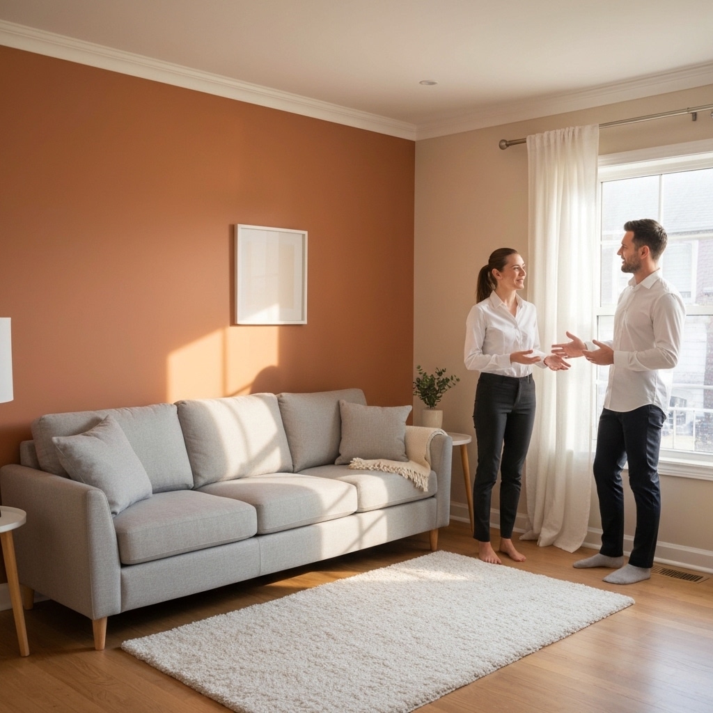
As I consider the impact of warm colors, I am struck by how they can evoke strong emotions. From vibrant reds to calming yellows, warm colors have the power to make us feel energized, passionate, and joyful. They can also create a cozy and inviting atmosphere, perfect for creating a sense of comfort and relaxation in a space.
Warm Colors and Emotions
When considering the impact of warm colors on emotions, one cannot underestimate their ability to create a sense of comfort and coziness. Warm colors, such as red, orange, and yellow, have a profound effect on our feelings and can evoke a feeling of warmth and safety. These colors have been found to increase productivity and stimulate appetite. The warm hues can create a welcoming and nurturing environment, making us feel at ease and secure. The red tones can energize and motivate us, while the orange and yellow shades can promote happiness and optimism. Whether it’s a warm-toned paint on the walls or accent pieces in these colors, incorporating warm hues into our surroundings can help create a soothing atmosphere that promotes emotional well-being.
Creating Cozy Environments
Exploring the impact of warm colors on emotions, incorporating these hues into our surroundings can create a cozy environment that promotes emotional well-being. When it comes to creating a cozy space, layering textures is key. Adding soft blankets, plush pillows, and fluffy rugs can instantly make a room feel warm and inviting. These textures not only provide physical comfort but also evoke a sense of safety and security. In addition to texture, incorporating natural elements can further enhance the cozy atmosphere. Bringing in elements such as wood, stone, or plants can create a connection to nature, which has a calming effect on our emotions. The combination of warm colors, layered textures, and natural elements can transform any space into a cozy sanctuary, providing a sense of comfort and tranquility.
The Serenity of Cool Colors
When it comes to creating a serene atmosphere, cool colors like blue and green have a powerful impact. Blue has a calming effect on the mind and can promote relaxation and tranquility. Green, on the other hand, has a soothing power that can make a space feel peaceful and rejuvenating.
Calming Effects of Blue
I’ve always been drawn to the calming effects of blue, as it effortlessly creates a serene atmosphere with its cool hues. Blue has long been recognized as a sleep aid, promoting relaxation and tranquility. Its soothing qualities help to calm the mind and prepare the body for a restful night’s sleep. In addition, blue is known to be a stress reducer, as it has the power to lower heart rate and blood pressure. When surrounded by blue, the body naturally begins to relax, easing tension and promoting a sense of calm. Whether it’s a soft blue bedroom or a peaceful blue living room, incorporating this color into your home can create a safe and tranquil environment that promotes a sense of well-being and peace.
Soothing Power of Green
To truly understand the soothing power of green, I have delved into the serenity of cool colors. Green is a color that has a calming effect on the mind and body, making it perfect for creating a safe and peaceful atmosphere. Its healing properties can help reduce stress and anxiety, promoting a sense of relaxation and tranquility. Inspired by nature, green brings a sense of harmony and balance to any space. Whether it’s a soft sage green or a vibrant emerald shade, incorporating green into your paint color choices can create a soothing and rejuvenating environment. So, if you desire a space that promotes a feeling of safety and serenity, consider the soothing power of green and let nature inspire your color choices.
The Power of Neutrals
In my experience, neutral colors have proven to be incredibly powerful in creating the right atmosphere. When it comes to color psychology, neutrals have a calming effect on our minds and can evoke a sense of safety and security. The impact of neutrals on our emotions is profound. Shades such as beige, gray, and taupe provide a soothing backdrop that promotes relaxation and tranquility. They create a sense of balance and harmony, making them ideal for spaces where safety is a top priority. Neutrals also have the ability to enhance natural light, making a room feel brighter and more spacious. Whether used as the main color or as a complement to bolder hues, neutrals have a timeless appeal that can transform any space into a welcoming and comforting environment.
Creating a Sense of Balance With Complementary Colors
One key way to create a sense of balance with paint colors is by incorporating complementary hues. Complementary colors are opposite each other on the color wheel, such as blue and orange or green and red. By using these colors together, you can create a strong color contrast that adds visual impact to your space. For example, if you have a predominantly blue room, adding touches of orange can create a sense of balance and harmony. The contrasting colors create a dynamic visual effect that draws the eye and adds interest to the space. When choosing complementary colors, it’s important to consider the intensity and saturation of the hues to ensure they work well together and create the desired atmosphere.
Using Analogous Colors for Harmonious Spaces
I find that using analogous colors creates a harmonious atmosphere in a space. When choosing complementary colors, it is important to consider creating visual harmony, and analogous colors can help achieve this. Analogous colors are colors that sit next to each other on the color wheel and share similar undertones. These colors naturally blend together and create a sense of unity and balance in a room. By using analogous colors, you can create a safe and soothing environment that promotes a sense of calm and relaxation. For example, using shades of blue and green in a bedroom can create a serene and peaceful atmosphere, perfect for a good night’s sleep. Overall, using analogous colors is a great way to create a visually appealing and harmonious space.
Harnessing the Energy of Bright and Bold Colors
Continuing from the previous subtopic, I have found that harnessing the energy of bright and bold colors can greatly impact the atmosphere of a space. Incorporating vibrant hues into your home can create a lively and stimulating environment. Bright and bold color schemes can evoke feelings of energy, excitement, and positivity. However, it is important to use these colors in moderation to avoid overwhelming the space. Consider using these colors as accents or focal points, rather than covering entire walls. Additionally, it is essential to choose colors that complement each other and create a harmonious balance. By carefully selecting and incorporating bright and bold colors, you can create a vibrant yet safe atmosphere in your home.
The Tranquility of Pastel Hues
To achieve a peaceful and serene ambiance, incorporate a few pastel hues into your space. Pastel colors, with their soft and gentle tones, have a calming effect on the mind and promote tranquility and mindfulness. The psychology of pastel colors suggests that they can help create a sense of relaxation and harmony in any environment. The light shades of pastels, such as pale blues, pinks, and greens, evoke a sense of calmness and serenity, making them perfect for bedrooms, meditation spaces, or areas where you want to encourage relaxation and reflection. By using pastel hues in your home, you can create a safe and soothing environment that promotes a peaceful state of mind and encourages mindfulness in your daily life.
Exploring Unique Color Combinations for a Distinctive Atmosphere
Incorporating unique color combinations can further enhance the distinctive atmosphere created by pastel hues. When it comes to choosing paint colors for a distinctive atmosphere, it’s important to think outside the box and consider unique color palettes. By incorporating unexpected hues, you can create a space that stands out and leaves a lasting impression. One way to achieve this is by combining complementary colors, such as pairing a soft blue with a vibrant orange or a muted green with a deep purple. These unexpected combinations add a sense of excitement and playfulness to the room, while still maintaining a safe and inviting atmosphere. Remember to consider the mood and purpose of the space when selecting unique color combinations, ensuring they align with the desired atmosphere you wish to create.